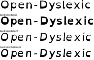
I’ve come across a few articles on the internet in the past week or so about a new font devised specifically to help pupils with Dyslexia. The font, called Open Dyslexic, apparently uses a device in which the bottoms of characters are weighted. Curiously some dyslexic pupils’ visual processing cortexes rotate images that look slender, making characters appear backwards or upside down. By making the bottom look “heavier” the font reportedly reduces this kind of visual “bug” in the brains of people with this reading disability.
Letters in Open Dyslexic have heavy weighted bottoms to add a kind of “gravity” to each letter, helping to keep the brain from rotating them around in ways that can make them look like other letters. Consistently weighted bottoms can also help reinforce the line of text. The unique shapes of each letter can help prevent flipping and swapping.
What is also interesting is that an app has been developed called OpenWeb which is a dyslexia-friendly web browser. It makes Open Dyslexic the default font on the web browser and it is free, open-source. It gives the internet a more readable style for people with dyslexia. It is available for iPhone (optimised for iPhone 5) , iPod Touch and iPad.
I’d be interested in hearing the opinions of teachers as to the effectiveness of using this font with pupils with dyslexia.


This is fascinating. I work with younger children and will get their feedback on it but would love to know what an adult with dyslexia would make of it. Thanks for the information.
Thanks for posting about this!
Hi Abelardo, Glad to be able to spread the word.
I have been trying to download this font onto my iPad for my son but can’t seemed to do it. any suggestion? Thanks.
Hi Marina, I’m not sure how this can be downloaded onto an iPad as on a PC it has to be inserted into the fonts folder. I think you’d have to do some research to find this out. I think it may be possible to add a font through your iTunes account, but I can’t be fully certain about that.